Icons: avoid temptation and start with user needs
Icons can be a useful way to represent ideas simply. Ben Cullimore, Interaction Designer in the team which redesigned the NHS website, explains how they decided on the most effective icons to use.
By Ben Cullimore, 25 March 2019
Icons represent ideas in a simple, visual way. But we must use them carefully, and only where they help people. Users’ needs must come first, and we shouldn’t be afraid to challenge how people use them.
I'm an interaction designer working in the team which redesigned the NHS website, previously NHS Choices. Over the years the site had developed lots of different navigation patterns and image styles to address the same user need.
Learning a new language
It’s tempting to throw a few icons on a page. But there are very few that everyone recognises. These include the icons for home, print, and search (the magnifying glass).
Expecting a user to understand a non-universal icon is like expecting them to learn a new language. And we know that most people don’t want to or can’t learn new languages easily.
That said, icons have their advantages. If they’re quickly recognised, they can be good targets for fingers and mouse cursors and they can overcome language barriers.
An icon for every occasion
There was a lack of consistency on the website – there were more than 30 icons, used as navigation, decoration and buttons. Our first task was to audit:
- what icons existed
- what user needs they met
- whether users understood them
- whether they were essential
- whether they were accessible
We also looked at the icons’ file formats, styles, sizes, colours and shapes. We also checked if there was any way of measuring their effectiveness with analytics.
We evaluated the 30 icons against two criteria:
- meeting specific user needs or
- being essential to the page
and reduced the number to 15.
A set of icons for the NHS
We decided if we were to use icons, they needed to look like they were from the same family. The NHS brand is well established and based on trust, with its distinct blue colour and Frutiger font. We had to be careful about introducing new elements. Rather than using free icons, we decided to create our own.
We had proved through testing that buttons with rounded corners looked more ‘clicky’, so we styled our icons similarly. Our assumption was that icons with rounded corners would stand out among elements such as the NHS logo, which are quite angular and boxy.
Decisions and testing
The hamburger
NHS Choices used a ‘hamburger’ icon to toggle the menu (the main navigation) but, while hamburgers are used on a lot of websites and apps, they aren’t universally understood.
On the new site, the menu link needed to sit in the new header alongside the NHS logo and search link. If we used the hamburger icon, we also needed a supporting label to be accessible (see Web Content Accessibility Guidelines 1.3.3). But then we lost the benefits of being simple and visually pleasing. The extra clutter would make it harder for users to scan.
‘Menu’ is a simple word and it didn’t fight with the NHS branding. We took it out to test with users.
We found that they had no problem navigating to the correct information via the menu and that their interpretation of the word ‘menu’ fits our model.

An example of our new navigation.
Exclamation or question
Exclamation marks and information icons had been used on the website’s health information pages to help users identify warnings and important content.
We took some new versions out to test with users in a shopping centre. To our astonishment, a number of users said that they wouldn’t read the information in the boxes. They likened them to advertising on news sites and overlooked them because of the ambiguity of the icon and the ‘READ ME!!!’ look.


We also found the exclamation icon caused more harm than good. Users who read the boxes misunderstood their importance. Some thought on first glance that the information was more important than emergency ‘call 999’ messaging, which it wasn’t.
So, we replaced the exclamation with the word ‘important’.

When we retested, having ‘Important’ worked for warnings. Users read the information and understood its importance. We’ve since added context-specific, short headings which also test well with users.
Removing the information icon was also effective. The blue left border worked well in highlighting information without making it appear more important than it should be.

Not all icons are bad
Whilst we found words more effective on certain components, some icons work well.
Do and Don’t lists have proved to reassure users. The tick and cross icons support the positive and negative statements and highlight information when users scan a page.

We also found arrow icons highlight ‘action’ links for users wanting to find help. They're noticeable but, unlike buttons, users actually read the link.

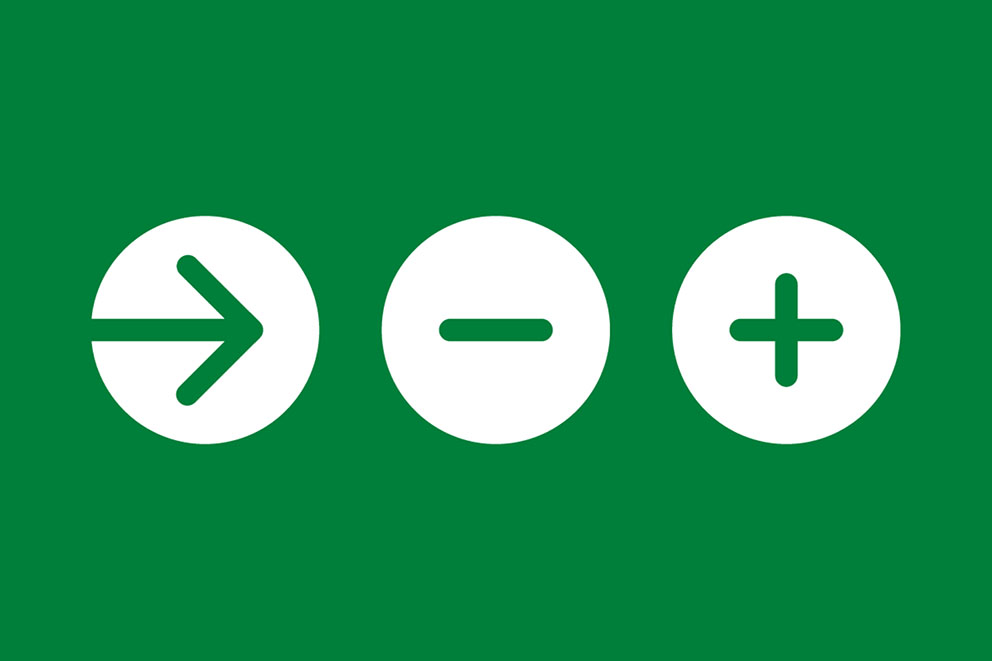
A final set of NHS icons
After lots of lab testing and pop-up sessions we ended up with a set of 11 icons
They’re a great start but it's important to remember that they were tested in specific contexts for specific needs. You should only add icons if research shows there’s something missing. Underpin everything with user research.
If you’re using the icons available in the NHS.UK frontend library in a health context, please feedback on how they’re working.
Last edited: 1 December 2021 12:05 pm