As part of the NHS 10 Year Health Plan, greater emphasis is being placed on prevention and helping people feel more able to improve their own health. Supporting people to build healthier habits in their daily lives could reduce preventable ill health and, over time, ease demand on NHS services.
The NHS Healthy Choices Quiz is a web-based tool that helps people reflect on 6 areas of their lifestyle: eating, drinking, physical activity, smoking or vaping, mental health and sleep. It provides a personalised score, tailored advice and links to relevant NHS apps, tools and resources, helping people identify a realistic next step towards healthier habits.
The challenge was not simply a lack of knowledge. Most people already understand what healthier choices look like, yet 83% of adults aged 40 to 60 in 2014 had at least one of 3 major lifestyle risk factors: drinking above recommended guidelines, physical activity, or being overweight or obese. Research with the target audience suggested that healthier living can feel overwhelming or out of reach, and that some people are sceptical about whether digital tools can help someone like them. The opportunity was therefore to create a simple, personalised first step that made healthier change feel achievable.

The NHS Healthy Choices Quiz was commissioned by the Department of Health and Social Care to encourage adults to reflect on their lifestyles and discover NHS support to build healthier habits. Unlike a clinical assessment, its purpose is to start a conversation about prevention and encourage people to take their first step towards positive behaviour change.
Over the past year, from July 2025 to July 2026, the NHS Healthy Choices Quiz has been completed more than 1.4 million times, with an 86% completion rate. Results are tailored to how people answer the quiz, and 38% of users go on to explore NHS tools, apps, and guidance that can help them build healthier habits.
Before the NHS.UK Campaigns team took over, much of the quiz was already defined. The questions, scoring algorithm and recommendations were based on policy, meaning our role wasn't to decide what advice people received, but how that advice was presented.
That led us to ask a simple question:
How can we make personalised health advice easier to understand and act on?
Over the past year, as we developed the minimum viable product (MVP) and continued to improve the service, our team learned a number of lessons about designing for understanding and action. Here are 4 that have stayed with me.
Lesson 1: You don’t have to choose between aesthetics and accessibility
Rather than creating a service that felt transactional or clinical, we were asked to design an experience that felt fun, approachable and engaging - more like a consumer quiz than a traditional NHS assessment.
That influenced the visual language of the service. Sharp corners were rounded to have a friendlier feel, the questions included iconography to illustrate the different options, the onward journeys from the results feature colourful imagery that uplifted the attractiveness of resources much more than a basic action link.
Even Kenny the hamster, a relatable mascot who shares wellbeing tips in a fun, authentic way, became a key part of driving traffic to the quiz. Ad testing found that the character was engaging, memorable and prompted a positive emotional response. People described the advert as entertaining, different from other government advertising and an effective way to make a serious health message feel more approachable.
It was actually quite a fun way to get over a serious message.
The visual language of the service helped create an experience that felt approachable, memorable, and supportive, which led to users engaging with the quiz and taking action on the results page.
It doesn’t scream NHS or corporate.
The photographs, more visuals … there is a human connection with the photography.
At the same time, we didn’t want aesthetics to come at the expense of accessibility.
To pass WCAG AA, improvements included adapting the chart in the results page to provide sufficient contrast, adding a chart description to support people in interpreting the visual, and ensuring colour wasn't the only way information was communicated.
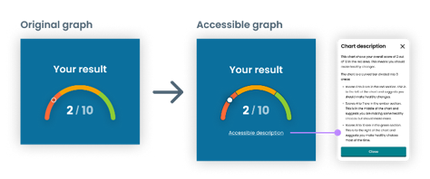
An accessibility audit reinforced that aesthetic design and accessibility don’t need to compete with one another. The most satisfying solutions were often the ones that achieved both.
Lesson 2: Pair colour with clear actions
The results page categorised the topics by a familiar traffic-light system: red, amber, and green.
At first glance, it seemed intuitive. But during design reviews, we realised we were asking users to infer what each colour meant. Was red telling people to stop? Was amber a warning? Or was it simply highlighting an area of their health that needed attention?
We wanted the colours to support understanding, not leave room for interpretation.
Working closely with our content designer, we paired each colour with a clear action:
Instead of 'red', it became 'Focus on changing ...'
Instead of 'amber', it became 'Try to improve ...'
Instead of 'green', it became 'Great job on ...'
Rather than relying on colour alone, every result now explained what the user should do next.
This small change had a noticeable impact during MVP testing. Research showed people understood what they should prioritise because the interface paired colour with clear language.
When I first scrolled through, I wasn't sure that the colours meant anything until I saw the 'Try to improve'.
The small piece of copy ended up turning colour from a visual cue into a clear instruction.
Looking back, one of our biggest lessons was that colour can communicate much more than status. When used intentionally, it can help people understand information, prioritise actions and navigate an experience confidently.
Lesson 3: Reducing effort can matter more than reducing content
Our most surprising learning came from redesigning the results page. From the outset, everyone recognised the results page contained a lot of information. However, much of that content was required by policy and couldn’t simply be removed.
Internally, we assumed the solution was to hide information inside expandable sections. Less content on screen would surely make the page feel less overwhelming.
User research told us a different story.
We tested 2 versions of the results page: Version A presented an overview of all health topics before showcasing each section in more detail, whereas version B collapsed each section into expanders.
To our surprise, version A just came out on top.
It wasn’t because there was less information. In fact, there was more content in version A. It was because the overview component provided a nice snapshot which summarised the results and therefore helped people to immediately understand what they were doing well in, what they could improve, and what they should focus on changing.
The overview prioritises for me. I'm naturally drawn to the areas for improvement. If you tell me there's one thing to improve out of 10, I'd focus on that one thing.
Version B felt more app-like with the need to click into sections. The ability to choose which section to expand gave users more control over their results, and the condensed layout helped with cognitive processing.
However, some participants preferred to avoid these unnecessary interactions, and opening the expanders introduced friction without adding value.
Some might prefer the ability to expand as it is neater, but I prefer the other one because you don't have to click.
The other [Variant A] is easier to find the information I need because I don't have click in and out.
This became an important reminder that reducing visible content does not always reduce complexity. Sometimes people just need a clear summary before they're ready to dive into the detail.
Lesson 4: Speak the user’s language
During one of our internal design critiques, the conversation kept stopping at the same place - the alcohol questions.
They were clinically accurate, but none of us answered them instinctively. We found ourselves translating everyday drinking habits into units and percentages before we could continue.
If a room full of designers, researchers and product managers had to stop and think, what would that experience be like for someone completing the quiz on their phone in 5 minutes?
So, we explored ways of reframing the questions without changing the underlying policy or scoring logic.
We replaced unit-based questions with questions about drinks consumed, introduced visual icons to represent the types of drinks, split overly complex questions into one question per page, and simplified the language wherever possible before taking the designs back into research.
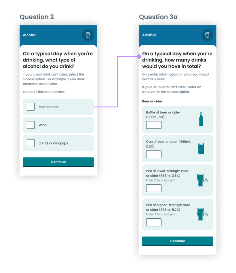
The difference was immediately noticeable. Participants appreciated that they no longer had to calculate alcohol units themselves.
I like that it doesn't talk about units. I don't drink a 'unit', I drink a bottle.
The redesign didn't change the information we needed from users, but we were able to reduce the cognitive effort required to get it.
Looking back
Looking back, none of these lessons were really about colours, expanders or alcohol questions. They were about helping people understand their health with as little effort as possible.
We focused on how advice was presented – using visual design to create engagement, colour to communicate meaning, information hierarchy to reduce effort and language that reflected how people naturally think about their lives.
Designing the NHS Healthy Choices Quiz reminded us that small design decisions often have the biggest impact. When people understand their results, they're much better placed to decide what to do next.
Take the quiz
Explore the NHS Healthy Choices Quiz to see how these design principles come together in practice.
Thank you to my colleagues Kat Mitchell (User Centred Design Lead, NHS Campaigns) and Amy Wheeler (Senior Insight & Evaluation Manager, Department of Health and Social Care) who contributed to this blog.



Author


Last edited: 23 September 2026 4:43 pm